PROJECTS
ENERGY MAPPING PROJECT.
TEAM
David Raxa.
MY ROLE
Everything. Survey Research, Data Synthesization, Javascript (P5js) coding, Figma Prototyping, Sound compilation.
DOWNLOAD FULL DESIGN PROCESS PDF
PROJECT OVERVIEW
When listening to music, usually we’d tend to listen to songs that blend well with our personal mood. Listening to a song at the gym will likely be different than the song I’m listening to during work. Because the scope of house music is so high, this genre has potential to encompass all moods. House music has the potential to change the amount of energy that’s built into its song. With the songs that are showcased, I will be presenting the amount of personal energy that’s being present in each house song.
RESEARCH
As a baseline for the composition, I marked my subjective energy level of 17 different songs. Each house song had a distinct and unique subgenre, which helped give variation in the amount of energy present.
AUDIENCE SURVEY
In order to get a better idea of my peer’s individual energy, a survey was created with phonic.ai and quizzed the individuals with a snippet of each song.
23 diverse Participants were surveyed on their personal energy levels.
CREATING THE SYSTEM
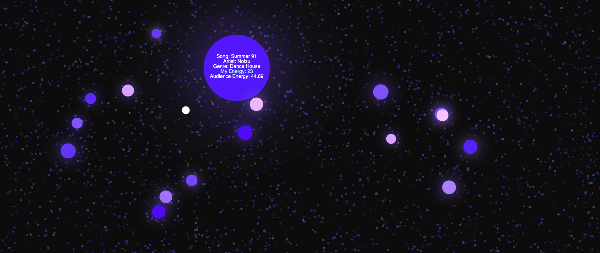
In order to correctly differentiate levels of energy, a color system was implemented.
(255*ENERGY)/100,ENERGY*2,255)
This was created to make bright pink energy levels and dark blue energy levels.
VISUALIZATION
Using audience data and research, I was able to objectively chart user data and research to gain comprehension. The audience’s score based on the survey was also created as the color of the small circles, which showcased comparison between energies.

